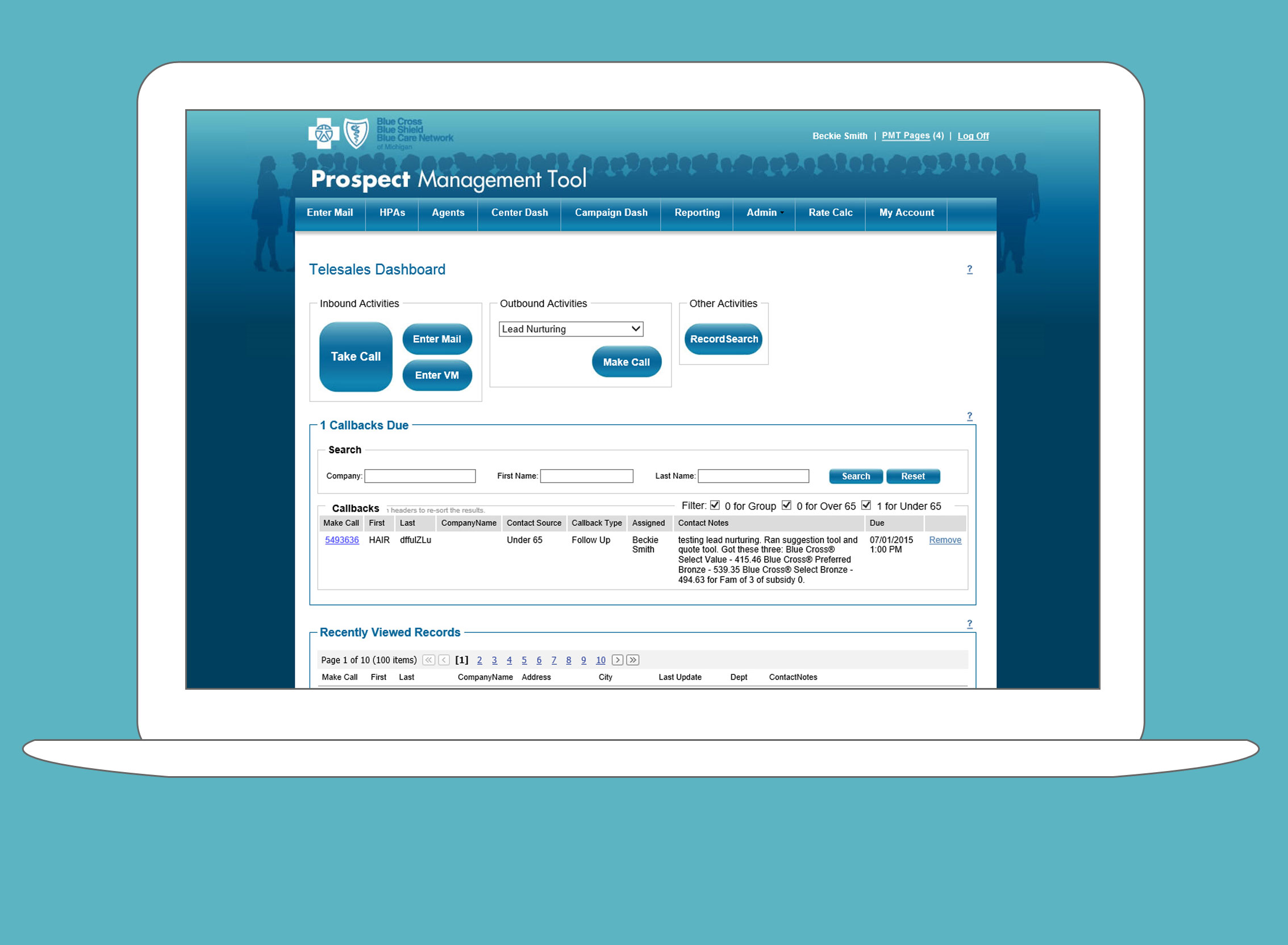
BCBSM Prospect Management Tool
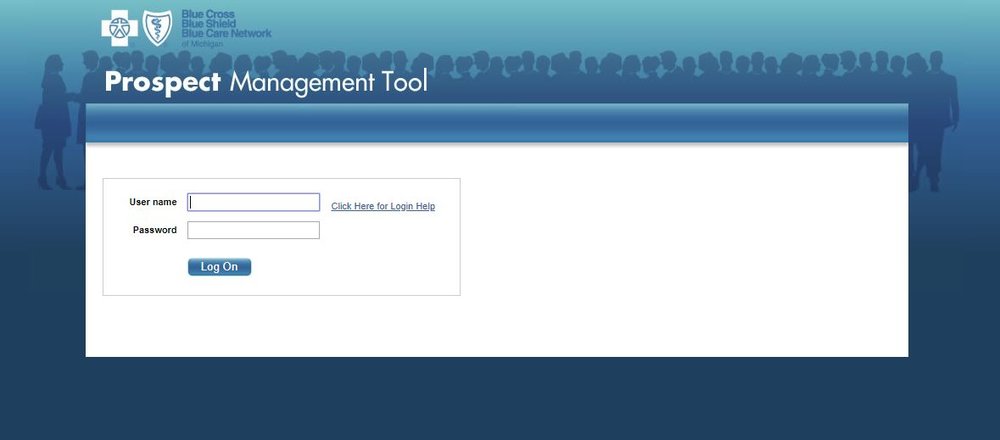
The Prospect Management Tool (PMT) is a CRM (Customer Relationship Management) system built for Blue Cross Blue Shield of Michigan.
Design Brief
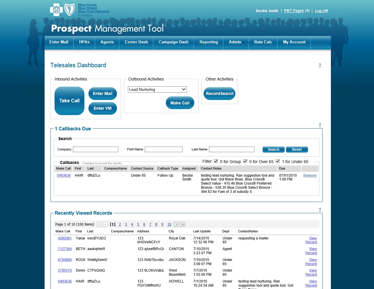
The PMT was originally made for the new Individual Business Unit, which was in the process of setting up a sales call center.
Initial Client
BCBSM Individual Business Unit
Additional Clients
Over 65 Individual, Individual Marketing, Small Group, Individual Outside Sales Agents
Dates
2005 – 2017
Business Goals
Track all prospect contacts and enrollments accurately, quickly and with data security enforced.
Additional Goals
Ability to pivot UI quickly for changing business needs.
User Goals
Support ability to efficiently sell to prospect contacts, in order to earn commissions.
This includes: finding prospect information quickly, tracking my sales, noting other prospects I talked to, provide personalize reports, provide the next outbound call, and automate repetitive tasks the support my sales (like reminders for callbacks, or sending emails and letters).
Strategy
The UI will find and display all available information for a prospect to the user, to facilitate a sales call, in an environment without a standard call script, and capture the contact results.
Design concerns include: quick screen loads, efficient process flows, minimizing data entry, enforce data entry standards, limit prospect data access to need-to-know staff only, automate processes to prevent human error, efficient search tools to prevent duplicate records, and use modular interfaces for easy screen mix and match.
Major Projects
IBU Call Center CRM, Outside Sales Agents CRM (IBU Over and Under 65, and Small Group), Reporting Platform, Campaign Management Tool, Automated Sales Lead Distribution, Fulfillment Manager, Knowledge Management Tool, Enrollment Integration, Custom Letter Platform, Email Generation Tool, Rate Calculator, Seamless Auto Enrollment, Seminar Registration, Product Suggestion Tool, Duplicate Record Merge Tool, and Issue Escalation Tracking System.
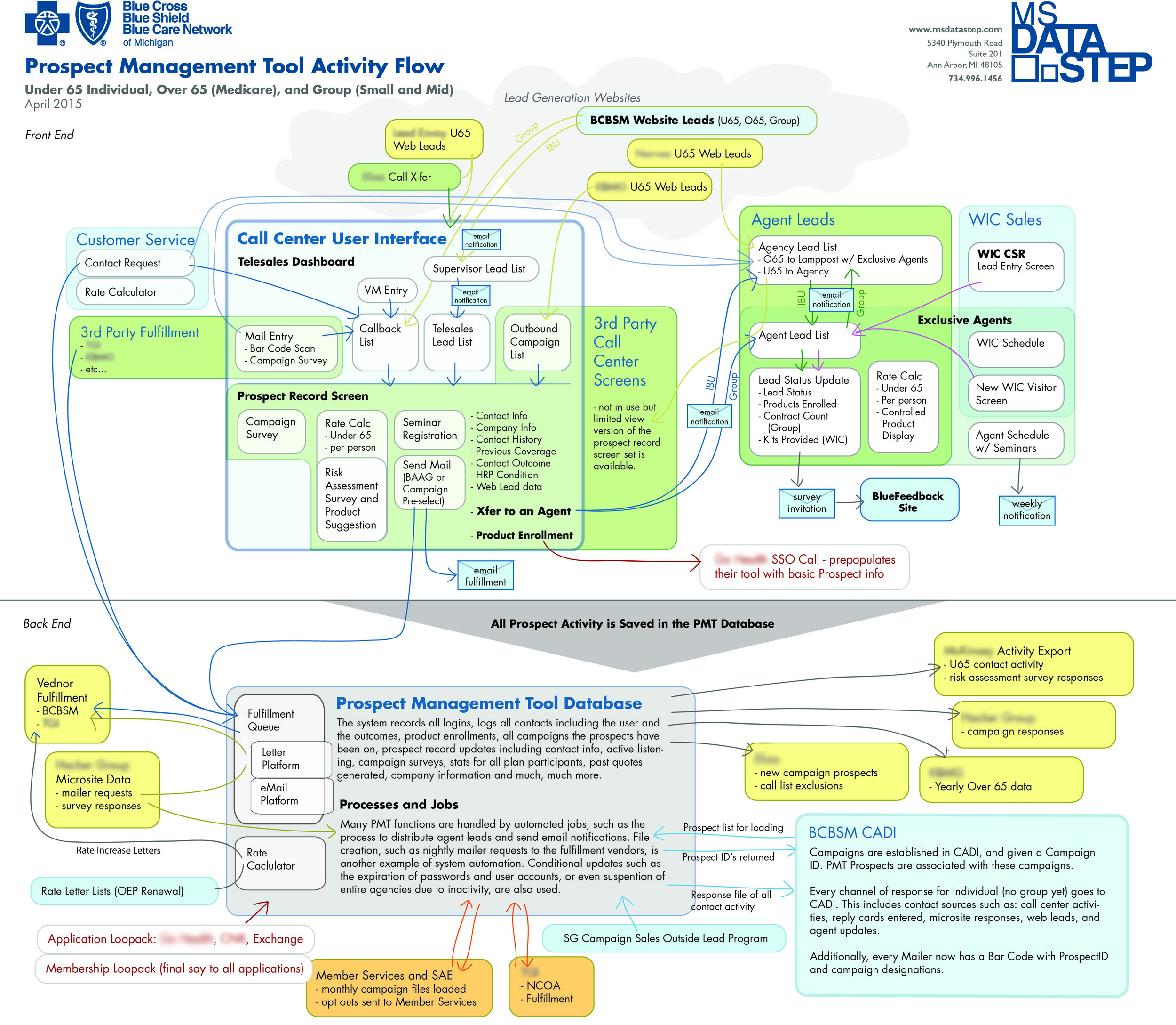
I was responsible for the UX and UI during the entire product lifespan, starting with the first version in 2005, until it’s sundown in 2017.
The system proved popular and other departments leveraged it to support their needs for sales, marketing campaigns, fulfillment, seminars, agent management, reporting and more. There were 3 major versions, with 10 to 20 smaller updates per year. At its largest, there were over 20 screens, two dozen user types, 300 discreet features, and over 14 additional back end processes for system integration.
Through it all, the PMT’s most pressing design concerns were quick and accurate process flows for complex employee tasks, and dynamic feature sets, customizable for different user types. This was an intense problem space, with different priorities than a typical customer facing project.
The Call Center's Solution
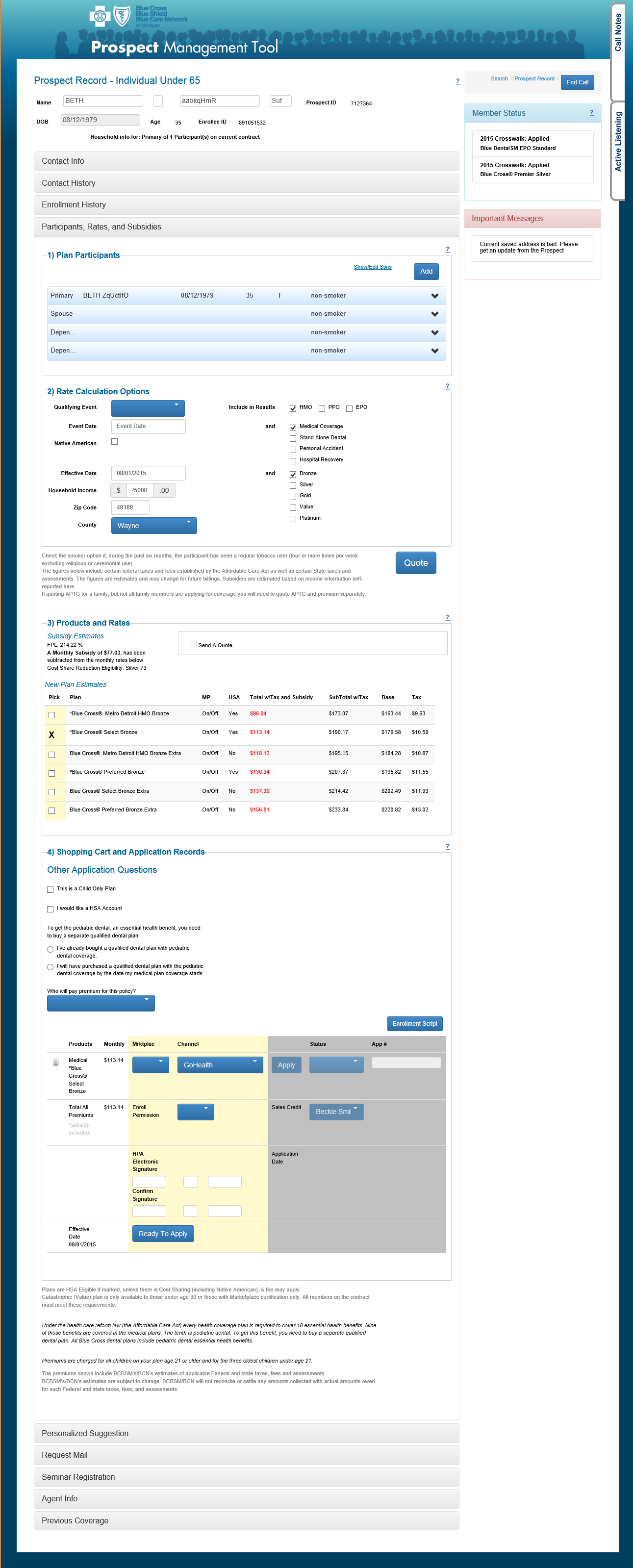
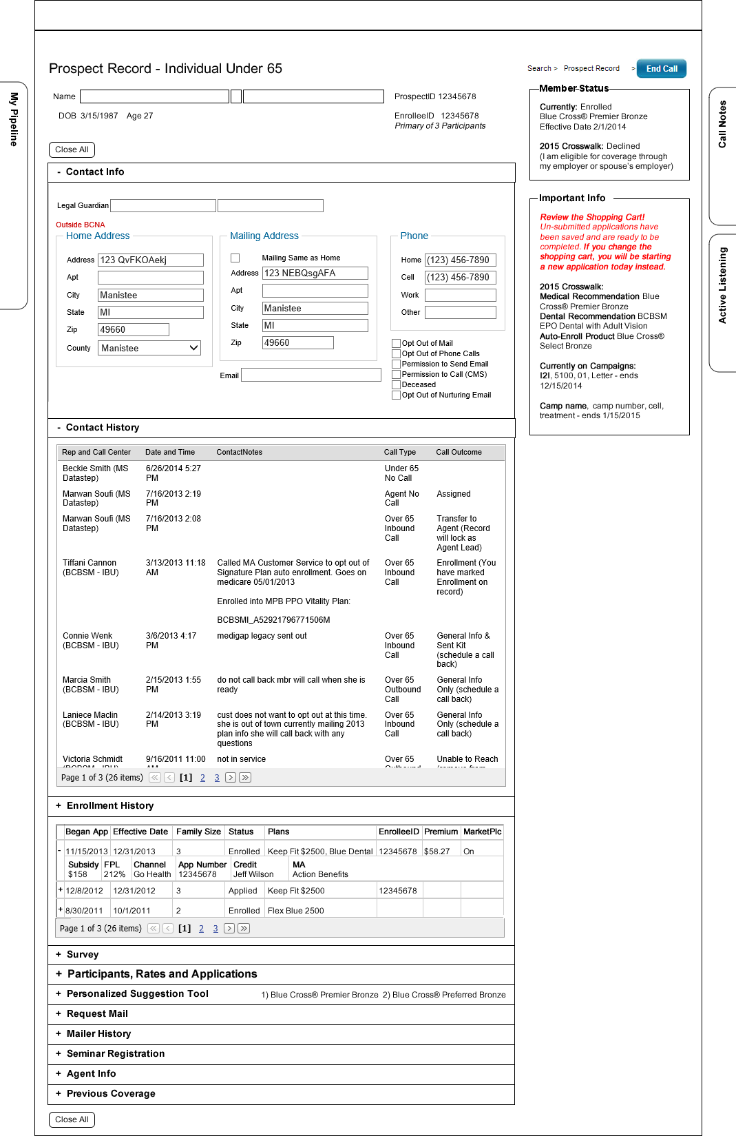
I’ve seen other call centers use a wizard style solution, with forced navigation, and watched the frustration as customers interjected off-script questions. This often required the rep to fast forward, and (to my horror) provide default answers so they could skip fields. BCBSM’s call center reps are highly trained, no-script-needed professionals. A wizard is too limited for what this crew was handling.
We solved the issue of script-less interaction a few different ways over the years, but the last was my favorite: feature sets encapsulated in accordions. Being able to open just the tools you need for the current conversation was much faster than navigating back and forth between tabs or screens. Accordions allowed me to design one central, feature packed screen, yet still have a small initial load to start with.
Research
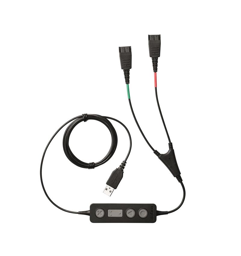
I worked closely with the client, and sat down with the sales reps frequently, listening to their calls and seeing how they used the system (It’s called Y-cording). I got to know their real-world needs, and hear what the customers were actually asking about. This gave me valuable information for each iteration of the system.
Wirefames and Prototyping
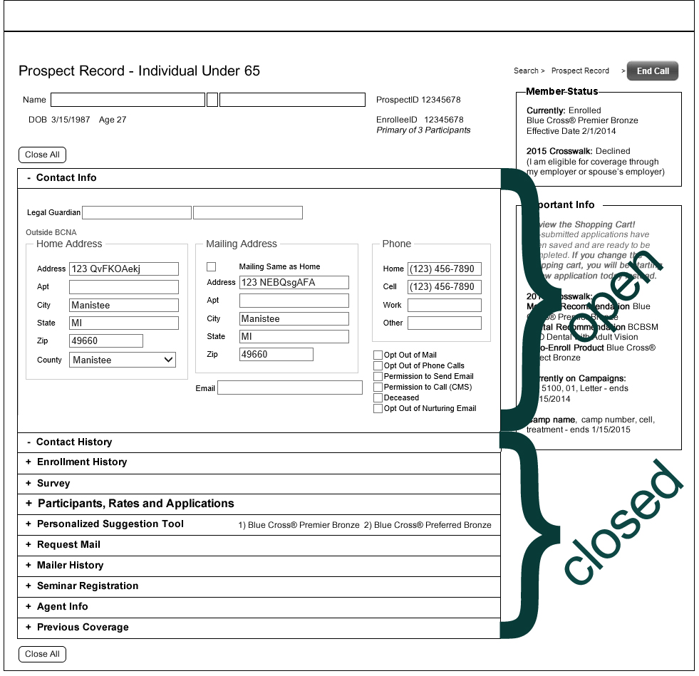
I needed a solution for paper prototyping a screen with many internally moving parts. I printed out wireframes, and cut out the modular elements into pieces, including the opened and closed versions of the accordions. I then assembled the screen by laying out these parts on a printed site background.
One by one the reps took a break from the phone to come test usability with me. I asked them to bring their last call to mind, and play it back for me, using the paper screens. When they pointed at things they wanted to click on, I moved the paper to show/hide features the same way the screen would respond. I also had a typical call event, taken from my own shadowing, that we went through, to make sure we hit all the bases. We found the sticking points quickly, and I was able to change the paper prototype on the spot, and then try it out with the next couple of reps. We iterated until the design was smoothed out that same day.
Through testing, we also found that the new screens required minimal instruction to use:
--Is the customer asking for a rate? Open up the section with ‘Rates’ in the title.
--Did they mention some “letter they just got”? We have a mailer section to show you which one was sent, and view it’s PDF.
--Is this prospect assigned to an outside sales agent? Open up the Agent section to provide that contact info.
--Want to jot down notes? Pull open the call notes area that is always in accessible on the side, no matter how far you scroll down.

Solution Trade-Offs
The accordion presented a particular challenge though. I had to decide what to show or hide by default. When the accordion is closed, it’s possible that pertinent information for the record could be hidden to the user, where a wizard process would enforce its view. I found a few ways around this, further solidifying that this was the right decision: 1) load the screen with select accordions set to open. 2) add dynamic data to the labels. For example, if there is an important status buried in the accordion’s contents that may need attention, it was displayed on the right side of the header bar. 3) We added “important info” areas that the reps would review upon opening a record, and this proved handy for all kinds of situations over the years.

Modular and Extensible is Key
Often the client’s best answer to a new business need was to reorganize staff so some of them could take on a niche task, or make more people available to meet current demands. They tried adding staff just for entering mailer responses, creating cross trained staff that could handle several department’s calls, triage staff that filtered out customer service calls and transferred sales calls, adding outsides sales agents – the list goes on and on. For security reasons, it was important that users only access the information they needed for their work, and no more. The UI design was able to accommodate these rules via modular screen organization. Sometimes we could even build an entirely new user type, just with database settings. This strategy saved us months of development time over the year.
This was another reason I advocated the accordion design, which packaged screen sections quite neatly. My understanding of the difference between front and back end development capabilities, and working on cross-functional team, led to an extensible design that really paid off a big chunk of technical debt.
Screen Speed in UX Design
Often tuning and optimization is last piece in the development process. First you make it work, then you make it fast. But I believe UX has to include screen speed as part of their strategic thinking to begin with, or you end up painting your developers into a corner.
Over time, speed issues appeared with our first PMT version, as updates were added and the database grew. At its worst, it was adding a minute or two to a call. Developers linked it to several issue, including screen bloat – too many features and data was loading at once. Since feature consolidation was already done as natural part of my design process, and eliminating existing features would hamstring business needs, it was clear it was time for a redesign. (well, that and clearing a traffic jam on their corporate internet.)
Now that we had been working with BCBSM for a while, and saw how often they experimented with new feature sets, our approach became increasingly modular and database driven, as seen in the latest version.
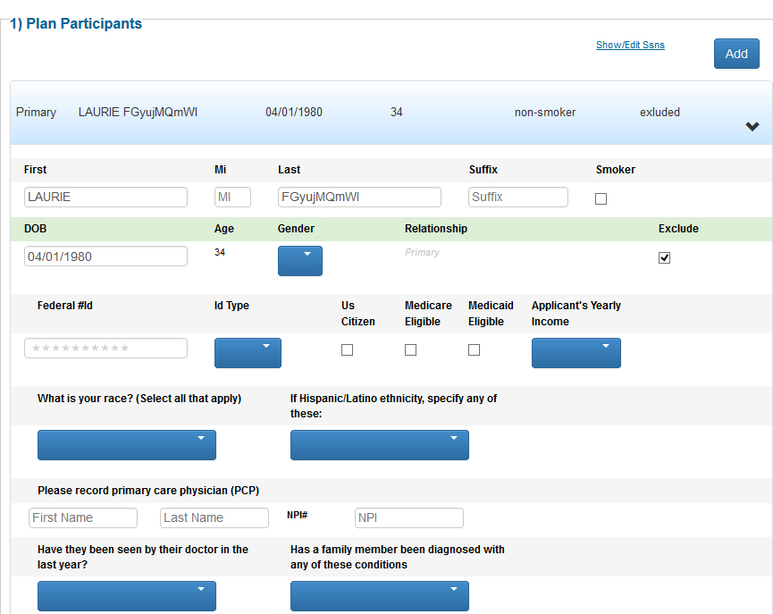
Again, accordions provided us with a solution. Closed accordions allowed us to keep the initial screen load small, even when changing client needs required that we added several new tool sets. Opening an accordion would pull down a bite sized amount of content, that was fast to display and judiciously provided. And thus we have speed optimization strategy as part of UX/UI design.
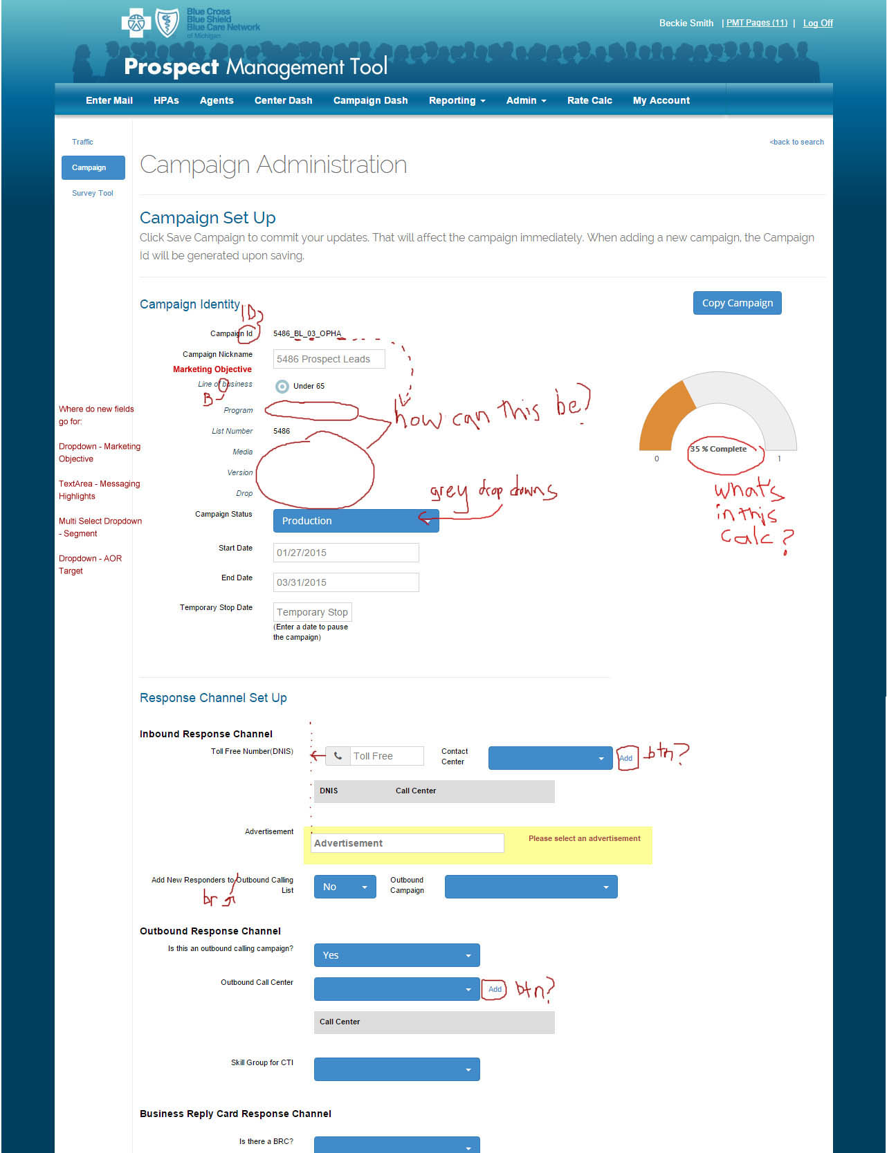
It turns out, looks aren’t everything
If I have one regret, it would be the looks of the system. As a designer, that’s a gut-wrenching thing to admit. Unfortunately, visual elegance was always the loser in our deadline wars. Instead, we were focused on process elegance, and flawless execution of functionality. Any data collection issues we created in a new release, be it from usability or a bug, would be our sole responsibility and blame. That kind of problem could domino into bad reports, which was much worse for the system’s reputation that an un-capitalized field label.
Since the project was not public facing, the client was primarily concerned that we meet the ambitious feature list goals and due dates, which represented a great deal of money if missed. So, unless we noticed a usability problem, ugly stood its ground, and spacing, alignment, and sometimes typos were left like battle scars of a hard won initiative.
I will also say this out loud too: during integration projects with other, more beautiful tools, I watched as we passed UAT with flying colors, and the competition lagged behind with major issues. I believe we had the right prioritization for this particular project, even though sometimes my designer’s eye would twitch.
This is my clever, ugly baby and she is a solid system. I’m super proud of her.
Goals Achieved
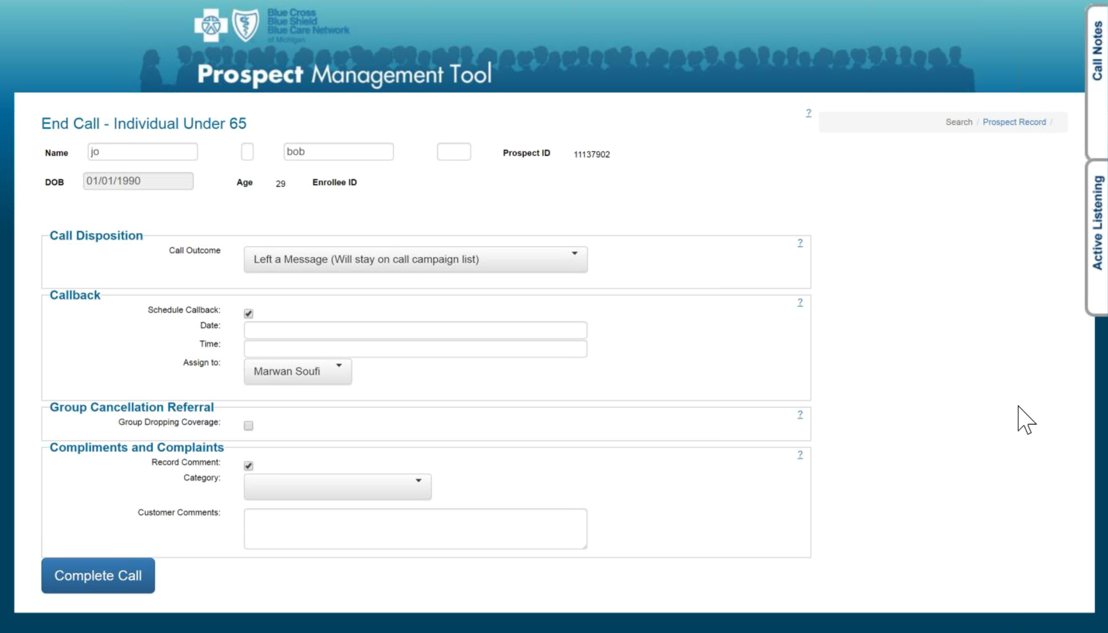
This system, through the efforts of my team and I, was to accomplish everything BCBSM asked, and more. With each release, we were suggesting new features to ramp up user efficiencies, even outside the PMT. We all but eliminated using scratch paper at their desk, or searching through binders of paper memos on a call. We made lead nurturing tool suggestions patterned after the habits of their most effective sales reps. With each new improvement of the PMT, the system helped bring down call times, kept more sales from falling through cracks, speed up new trainee on-boarding, and all the while collected accurate data. We also helped BCBSM managers get the easiest access to reports they had ever had, and saved them from countless hours huddled over excel spreadsheets.
The project ended shortly after a business decision was made to transition the last call center teams permanently to external vendors. Without the leadership and funding of the call centers, the departments that were leveraging the PMT in order to fill process gaps, or to experiment with new services, also bowed out. One by one they either proved their concepts and transitioned to new internal solutions, ended the initiative, or just decided to off-load the whole thing to a vendor. The PMT weaned off it’s last users. It was a good run.
All rights reserved. If you are interested in images on this site, just ask! Use the handy contact form link above.