
AAA Savings Platform
A regional AAA club wanted to refresh their loyalty program UI for members, as part of a larger corporate website overhaul. My team had built their last discount offer system as well, and they came to us for the update. I designed new websites to coordinate with their new corporate look, all the while improving and expanding what they had before. Of note was the increased usability of searching, and how it helped the users discover new discounts and prizes they did not know about yet. There were also totally new features like prizes, and a new process for flow for administrators to manage it all.

Recommendations and searching
Personalized recommendations was a new page designed to be an interesting and relevant place for users to start their site visit. It was a big improvement on a static list of just what discounts were closest. Content was coordinated with dynamically generated email marketing as well, so this page had something new and interesting to offer each visit.
If the user wanted to search for something specific, they could do so on the same screen, using the left side column. This sub-menus area was carved out site-wide in the corporate website, so I utilized it for the search controls, giving users a consistent spot for low level navigation on our screens as well.
By using expandable sections to show and hide filter options, I was able to provide as simple or complex a search as the user wanted, without resorting to wizards, or an “advanced search” screen set. Users could see their results change in real time to the right, and adjust their search as necessary on the left.

It's all in the details
The details screen was kept as simple as possible, while anticipating the most common customer needs: What is the discount? Who is it from? How do I get it? and, Where are they?
The challenge for this screen laid in the variety of details an offer could have. There were only about 5 required elements, but deals could have a mix of around 20 or so different field types in the database, any of which triggered the display of either text or a feature. Some deals had printable coupons to bring to the store. Some had coupon codes for a website. Sometimes redemption details were hidden behind a login, and sometimes they were not. There were even elements that could display multiple times, like if there was more than one store branch address. This meant designing a flexible layout that can handle a wide variety of content and features combinations, and still look great in all situations.

Prizes
Nothing sparks interest and collects email addresses from the public like free stuff. A new dynamic prize platform was part of the project so administers could quickly add new sweepstakes. This system generated pages and site-wide menu items dynamically, without needed a developer to update the website.
The beautiful prize system had similar dynamic data needs as the deal details screens. This included the ability to add user surveys and survey questions, a custom banner image, a custom rules screen, and a special selection of offers to show with the entry confirmation message.
The UX was neat little flow that had to account for users filling out multiple entries. We didn’t want them to take they survey multiple times because if they answered the questions differently it would muddle the results analysis. I designed a flow that skipped known users over questions they have already completed, or bypassed them completely if need be.
And lastly, participants could see who won, once the sweepstakes was over, on the winners page.
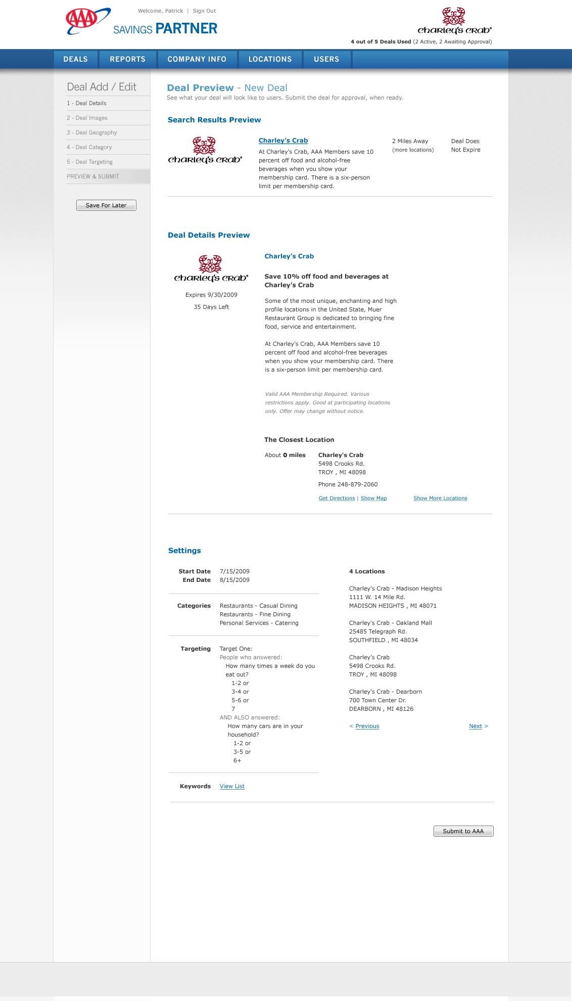
The extraordinary power of the admin screens
AAA administrators were given their own screen set to add, update and remove deals and prizes. The data required to support each offer was necessarily complex in order fill the needs of the customer, the partner’s discount rules, and corporate tracking needs. This means that deal entries were often abandoned or paused when the user realized they were missing some crucial piece of info. And while this part of the system was internal, and staff could be trained, the UI still had to be clear enough to guide users through the process, and known process exceptions, as if they were new. Some folks only touched this system once in a blue moon. The layout had to be straight forward, yet handle a wide variety of wild promotion ideas. Tall order, but doable.
In addition, partnering businesses who wanted to offer a discount to this very large pool of AAA members, could have their own user account and enter deals with their own, separate screen sets. But not just any old offer was acceptable to AAA. There needed to be an approval process too, so every Partner entered offer needed the relevant administrator to be notified. And if the deal was denied, there was a place to make notes as to why. Notifications let the partner update the offer and try again if they wished.
And lastly, additional email notifications and screen displays of deal activity were designed to help keep everyone informed, but only about the changes each user cared about. This meant a variety of roles and business unit associations were part of the user profile definition, adding to the complexity of who was an administrator, and what they presided over.
The admin screen set ended up being far more complex that the dynamic customer facing screens.
What a system! I flowed every process and laid out every field.
All rights reserved. If you are interested in images on this site, just ask! Use the handy contact form link above.